Blog #17 - Postcard
Ava Farrelly


Left - Front of Post Card
Right - Back of Post Card

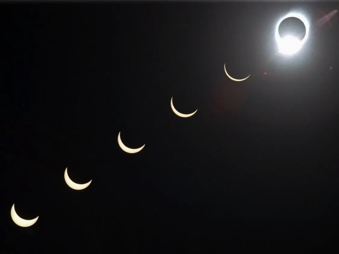
Left - Final Inspirational Image used for post card
Right - Original Image I wanted to use but did not end up using
Artist Statement -
For this project on the Eclipse Postcard, I wanted to create a collage of many different eclipses in order to make something fun and different. The overall basic idea is to make the post card look realistic yet fun with an effect of a collage. The word colors match the colors of the various moons shown in the image on the background. Originally, I tried creating the moons myself with various fun colors, trying to make each one look differently. I was going to match the font colors to the various colors used in the colors behind the moons, but instead I chose to match the color to the orange used. The final version background gives a 3d effect, which I was happy with. One of the difficulties of this assignment was figuring out how to outline the text boxes in order to show an outline for the post card.


Comments
Post a Comment