Posts

Final Blog - Portfolio

Image
 Ava Farrelly   Artist Statement -  As the semester comes to an end, I want to take this opportunity to reflect on everything throughout the semester as well as the portfolio. Of all the projects we created it was hard to chose a favorite. I will say, out of the three programs we learned and used during class, my personal favorite program was InDesign. Being a photographer for the school, I have seen some of my friends us Photoshop for various things but I had never used it myself. For the portfolio, I chose colors based off of the previous project completed in this class. I waned the Portfolio to appear clean and put together, with the same fonts for the body texts throughout the work, as well as bold and capitalized titles. Overall, I am extremely happy with how the final portfolio turned out, and I think this was one of my favorite projects we did this semester.  Thank you for everything, professor. I hope you have a phenomenal summer. GO BOLTS!

Blog #19 - Business Cards

Image
Ava Farrelly  Artist Statement:  For the final three business cards, I chose to stick to the color of blue, as blue is my favorite color. My car is a specific unique shade of blue, and this color blue is my "go-to" color for most projects. Originally, I wanted to incorporate the beach and the sunshine, in order to convey my love for the outdoors and nature. The ideas for each card came from inspiration of the original sketches, though I did make some modifications to colors and spacing. Overall, I am happy with how the cards turned out and I have to say that the cards in the middle are my favorite. I did those second out of the three and I think they came out the best. However, I did have issues removing the lines through the boxes, but in dropbox those lines do not show up. I really liked this project, as I am hoping to own my own photography business one day, and am already beginning the process of representing myself through my photography brand.     

Blog #16 - ID HW 1

 Ava Farrelly Video 1 -  Learn Adobe InDesign in 11 MINUTES! | 2023 Beginner Basicswww.youtube.com › watch The easiest tool for me to use based on this first video will be the "fit frame" tool variations. I have already used this tool multiple times and it has been extremely helpful and so far the most used. The hardest thing for me to use will be remembering what the dimensions will be  when beginning a project. Each project has a different dimensions, so remembering the specific heights/weight, bleeds and other things will be difficult. I will be using the fitting tools the most, as there seems to be issues with cropping and scaling images moves the entirety of the page and the image. It moves everything and messes everything up. I really liked this video and it was extremely helpful as everything was extremely clear and all of the projects/instructions were given with visual examples.  Video 2 -  Get Started with 10 Beginner Tips for InDesign - YouTubewww.you...

Blog #18 - Sketches of Business Cards

Image
 Ava Farrelly 12 sketches Top Left - Original ID designs of business card sketches Bottom Left/Right - Final 12 Business Card Sketches  Artist Statement- Originally, I began to sketch out the 12 outlines of my business cards inside of InDesign. Upon realizing this was incorrect, I moved the designs onto paper, and completed all 12 with colors. For the designs, I chose various things that are positive and often attract a lot of attention, as a business often needs to do. #1 - sideways beach logo with the logo and writing on the "sand" part of the beach business card #2 - blue bubbles with dark lettering inside the bubbles explaining what needs to be said on a business card #3 - pink logo big and bright on the front to draw attention, all of the information and contacts on the back of the card, in order to remain organized, strong, and serious #4 - two different color yellows, with the logo and information in dark colors on top of the brighter yellow sections in order to "...

CURRENTLY WORKING ON

Image
  Ava Farrelly - I am currently in the process of finishing multiple projects, as I have been extremely busy and not feeling well over the past few days.  Blog #15 - IDHW 1 Blog #16 - Animation Blog #19 - Business Cards  I am in the process of receiving help from a friend on the animation, as I have been struggling. I am almost done with the IDHW1.  I began doing the sketches in InDesign, as I did not realize they were to be done on paper, so I am currently transitioning the ID designs of the business cards to paper. 

Blog #17 - Postcard

Image
 Ava Farrelly Left - Front of Post Card Right - Back of Post Card Left - Final Inspirational Image used for post card  Right - Original Image I wanted to use but did not end up using Artist Statement -  For this project on the Eclipse Postcard, I wanted to create a collage of many different eclipses in order to make something fun and different. The overall basic idea is to make the post card look realistic yet fun with an effect of a collage. The word colors match the colors of the various moons shown in the image on the background. Originally, I tried creating the moons myself with various fun colors, trying to make each one look differently. I was going to match the font colors to the various colors used in the colors behind the moons, but instead I chose to match the color to the orange used. The final version background gives a 3d effect, which I was happy with. One of the difficulties of this assignment was figuring out how to outline the text boxes in order to show ...

Blog #14 - Storyboard For Animation

Image
 Ava Farrelly Artist statement:  For the storyboard of this animation project, I wanted to convey a meaningful message that was not going to be too difficult to create.  The general idea for this project was to show the story of life as one grows from a small baby to a fully grown running adult. Ideally, I am envisioning the transitions similar to turning the page of a book. I chose to use the idea of a baby growing into an adult ending with an outdoor run, because I think it won't be terribly difficult to create, but also give me lots of room to play around and use various tools to show the human growth from baby to adult. 

Blog #10 - BW to Color

Image
 Ava Farrelly The three colors chosen: pinks (analogous), middle (triad), blues (monochrome) The original photo and the black&white version of the original photo:                                                    Final images: Left-analogous, Middle - triad, Right - monochrome Artist Statement:  For this project, took a picture of myself over spring break in front of the San Diego Jetties, in California. I have never visited the west cost so I thought that this would be a unique picture to use because I was genuinely excited to see something (and a somewhere) new. My initial Idea was to use wild and bright colors to make the original picture look vastly different from the final color version. The largest issue I ran into with this project was finding the same way to do things on a Laptop as originally done on Windows. I asked a f...

Blog #12 - Somewhere

Image
 Ava Farrelly  Image of myself: Myself at my sisters wedding in January of this year.  Image of show: Bridgerton Season 1 Final Frame Still: Me + Bridgerton Ball  Artist Statement -  For this project, I chose to incorporate a recent picture of myself during a happy event into my favorite show; Bridgerton. I chose to use a photo of myself from my older sister's wedding in January because I was wearing a fancy dress and my hair was done into a stylish braided ponytail. I chose this photo because I thought it matched the "fancy-ness" of the Bridgerton scene. This is part of the reason why I chose to hide myself behind a few other background characters, as I am not wearing a ball gown. The previous ideas I experimented/tried with other photos of myself for this project were "Outer Banks", "How to Lose a Guy in 10 Days", and "Friends". I chose to do this one, as I feel the fancy wedding outfit/hair matches the overall vibe/genre of the scene in Br...

Blog #13 - Anim HW 1

 Ava Farrelly  Find 3 tutorial videos that are about Frame by Frame animation in Photoshop for beginners.  Watch the videos. It is optional if you follow along.  Write down any questions you may have so we can discuss in class. In your Blog:   - imbed the videos with included link - under each video write 1-2 paragraphs if you think which tool/tools will be easy or hard to use, how you might use it and what you find interesting about the video. 1. Photoshop Animation Tutorial: Frame by Frame Character Walkwww.youtube.com › watch The move tool with auto select will be the best to use when drawing across animations, as we can see originally what was there and still be able to proceed with what needs to be drawn.  Motion has to have a change in imagery according to this video, so I think it will be difficult to remember how to click/drag contact groups in order to duplicate across layers. I watched this portion of the video more than once, as hearing/watching ...

Blog #11 - PS HW 3

Image
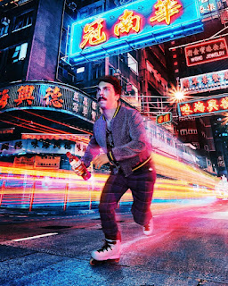
 Ava Farrelly  Write a blog post after visiting these 4 websites/links: go to  https://www.instagram.com/kirbyjenner/?hl=en Links to an external site. ; find 1 image you think it would be really hard to Photoshop yourself in to, post the image and the comment on your blog  I do believe this image would be extremely hard to use in photoshop, as there are many bright colors and things moving through the photo. The fact that he was able to photoshop various color shadows/reflections on to his face and body while giving the illusion that he (and other things around him) are moving, is extremely impressive. I do not think that I would be able to photoshop myself into an image this complicated.  go to  https://www.instagram.com/averagerob/ Links to an external site. ;  find 1 image that inspired you or gave you an idea for the "Somewhere" project. Post the image and the comment on your blog   This image from instagram gave me an idea for my "Somewhere" ...

Blog #9 - PS HW 2

Image
Ava Farrelly 1-Watch Documentary 2 - Write a 3-4 paragraph blog post   answering these questions, (include pictures/screenshots).  •  In your own words, describe an image from the documentary or  “The People’s Portfolio”  that brought you close to your own emotions?  As a soccer coach for young kids, I felt compelled to choose this image to reflect on, as the faces of children that I typically see are happy ones. Being a soccer coach, it is my job to ensure the safety, happiness, and imagination of the children I coach. That being said, seeing sad children who ban together, as shown in the image above, I was instantly drawn to the photo and alarmed. I wanted to learn more on this photo and understand what was going on to make these children look so unhappy. No child deserves to be unhappy, so this image was close to my own emotions as I work with children (age 2 to six) every week. For the soccer program that I coach, each child receives a stamp on their ha...

Blog #8 - PS HW 1

 Ava Farrelly Video 1 Link -  https://www.youtube.com/watch?v=sF_jSrBhdlg Summary - The tool that will be easiest to use, in my opinion, is the export and format tools once the work is completed. I did not know that certain types of work had to be exported in specific ways for printers. Once learning how to properly export, I think this will be the easiest tool to remember and to use. This video was a brief intro and did not have much details on the specific tools of Photoshop. The most interesting segment in this video was the brief description of the various layers and their folders. The layers portion is similar to Illustrator but the folder portion is something I had not seen before.  Video 2  Link -  https://www.youtube.com/watch?v=xFN4Hho4RNM Summary - I believe the "Type" tool will be the easiest to use, as we have already spent ample time practicing with this tool through our work with illustrator. Because of our previous work with the "Text" tool, I bel...

Blog #7 - TagBrush

Image
 Ava Farrelly Image 1 (right) - Experimental Logo Tag Brush Image 2 (left) - Black and White Logo Tag Brush Artist Statement -  I have little knowledge of photoshop with anything other than UT Athletic Score Graphics. Though my knowledge on photoshop is limited, I did some research and followed the PDF step by step in order to create the colorful logos in image 1. For this piece, I decided to include both of the original black and white Logo's, hoping to give the Tag Brush some variety and to experiment with the tools in photoshop. Alongside the "scratches" we were required to include, I also chose to layer "spray" on top of the previous layer. Doing this assignment from a laptop rather than a desktop proved to be difficult. I was able to accurately follow the document outlining instructions in dropbox, however, the process was tedious over the laptop.  The two images above are proof of the difficulties I was having, as certain tools either were not options on m...

Blog #6 - Self Portrait / Poster

Image
 Ava Farrelly Image 1 (right) - Inspiration Self Portrait Photo Image 2 (middle) - First Draft Image 3 (right) - Updated Final Draft Image 4 (left) - Inspirational Propaganda poster, "Rosie The Riveter" Artist Statement -  For this Self Portrait/Poster project, I decided to use an image of myself in my work uniform for the UT Athletic office. I work in this office as a student photographer for athletic events, practices, and games. I am extremely passionate about my work, but often find myself in the background of a male dominated field. This is why I chose to relate my poster to that of "Rosie The Riveter", as a sign of women empowerment. The field of sports is dominated by men, even at the collegiate level, so the idea of the poster stemmed from that notion. I decided to draw myself twice, as to give some difference between my poster design and the inspirational propaganda poster. Drawing myself with my hands on my hips also shows empowerment and attitude, as Rosi...